It was love at first sight. The first time I saw the work of Saul Bass I fell madly in love with it.
What I saw that first time was the title sequence of Alfred Hitchcock’s “Vertigo.” It was 1973, and the movie was being shown at the Bing Theater in the Los Angeles County Museum of Art as part of a tribute to Hitchcock organized by the Bing’s program director, the late Ron Haver. Here’s what I saw (watch it in full-screen mode if you can):
Also displayed at the theater was a one-sheet movie poster, by Bass, for “Vertigo.” It was unlike any other movie poster I had ever seen:
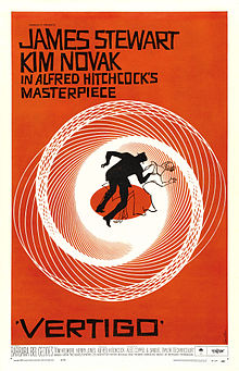
How creative. The titles and poster are just right.
Bass once wrote this delightful anecdote about what he did:
“My mother has a definition for creativity. For years she’s wondered what I do: that is, what I really do. She knew I did art work — and actually she was very happy about it despite some vagueness that surrounded the matter. Her only concern was that I should make a living and I seemed to be doing all right. But finally her curiosity overcame her timidity and, I think with some prompting from the neighbors, she finally asked me what it was that I really did.
“I pulled out a proof of an ad that I had designed and I showed it to her and said, ‘Mom, that’s what I do.’ She looked at this and said, ‘Oh, I see …’ and she pointed to a photograph in the ad and said, ‘That’s what you do?’ I said, ‘Oh no, you see, there are photographers — they are specialists — they know all about cameras and things of this kind, and they make the photographs.’
“‘Oh,’ she said, disappointed. ‘Then this is what you do?’ I said ‘No, that’s typography … you see there are special organizations who do nothing but set type — you know, Garamond, Caslon, etc. — these people do that.’
“Again, she was a little disappointed. She pointed to the lettering and we went through this again. Finally she looked at me somewhat concerned and said, ‘Well, now, what do you do?’ I said, ‘Well, you see, I conceive the whole thing, and then I get all these people together and get them to carry out the process.’
“She looked at me very coyly, and said, ‘Oh — you devil!’
“That’s my mother’s definition of creativity”
Academy Award-winning director Marty Scorsese once wrote: “Saul Bass. Before I ever met him, before we worked together, he was a legend in my eyes. His designs, for film titles and company logos and record albums and posters, defined an era. In essence, they found and distilled the poetry of the modern, industrialized world. They gave us a series of crystallized images, expressions of who and where we were and of the future ahead of us. They were images you could dream on. They still are.”
Scorsese wrote that in the foreword to the most complete book yet published about Bass and his work, “Saul Bass: A Life in Film & Design,” from 2011. It’s a coffee table-size opus of 400 pages or so, filled with wonderful pictures of Bass’ work. It’s also a biography of Bass. It took years to put together, and kudos to its authors, Jennifer Bass (Saul’s daughter) and Pat Kirkham. Saul himself died in 1996, just about two weeks shy of his 76th birthday.
I think what Scorsese wrote captures how a lot of us feel about Bass’ work. It’s certainly how I feel. I was a junior at UCLA when I saw “Vertigo,” and soon after seeing the movie, in my spare time, I started researching other work Bass had done, and started collecting what I could.
I’ve been particularly interested in the posters and ads Bass did for the movies. And a lot of times they were connected. For example, you’ve seen his poster for “Vertigo,” above. Here’s a copy of an ad for the film, which ran in at least two colors, in Life and Look and many of the top magazines of the day:
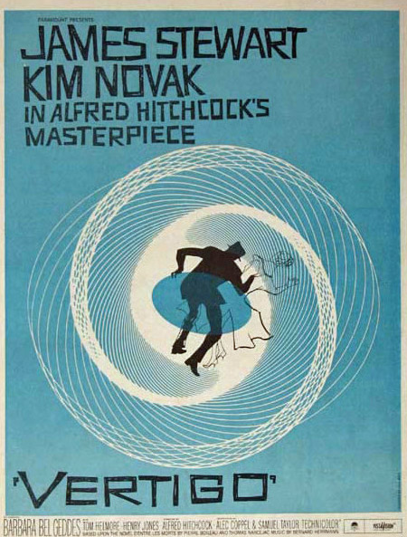
In this case the poster and the ads were virtually the same, and they both might be thought of as quintessential Saul Bass. But “Vertigo” didn’t come out until 1958, when Bass was 38 years old. By that time he had been working on movie ads, on and off — mostly on — for 20 years. The more interesting question, to me, is “How did his movie work evolve during those 20 years.”
The problem with answering that question is that we’ve only got sporadic information on which specific films Bass worked on earlier in his career.
Bass was born in the Bronx section of New York in 1920, and was already working on movie ads by the time he was 18.
While in New York, Bass worked for United Artists, Warner Bros. and Twentieth Century Fox. He also worked at some advertising agencies.
It was sometime during this time frame in New York that Al Kallis, now 90, recalls first meeting Bass. Al’s dad, Mischa — aka Maurice — an accomplished artist himself, was a top ad executive at Paramount Pictures, based in New York City. “Saul did lettering and paste-up, mostly for other studios,” Kallis told me. “I was interested in becoming an artist myself and I’d be hanging out with my Dad at his office and I recall meeting Saul.”
Maurice Kallis lost his job at Paramount and was then hired by Universal-International. But to take the job Maurice had to move to Los Angeles, which he did in 1943.
Three years later, Bass himself moved to Los Angeles, to work at the then-brand-new Los Angeles office of the ad agency Buchanan and Company. Through the agency, Bass started working closely with independent producer Stanley Kramer, who, according to an oral history done with Bass by Douglas Bell of the Academy of Motion Picture Arts & Sciences, “desired to be personally involved with the production of advertising” for his films.
In 1949 Bass came up with an ad for Kramer’s “Champion” that Bass said was considered a breakthrough in movie advertising. Here’s the ad — it’s all black and white except for the word “Champion,” which appears twice in the ad:
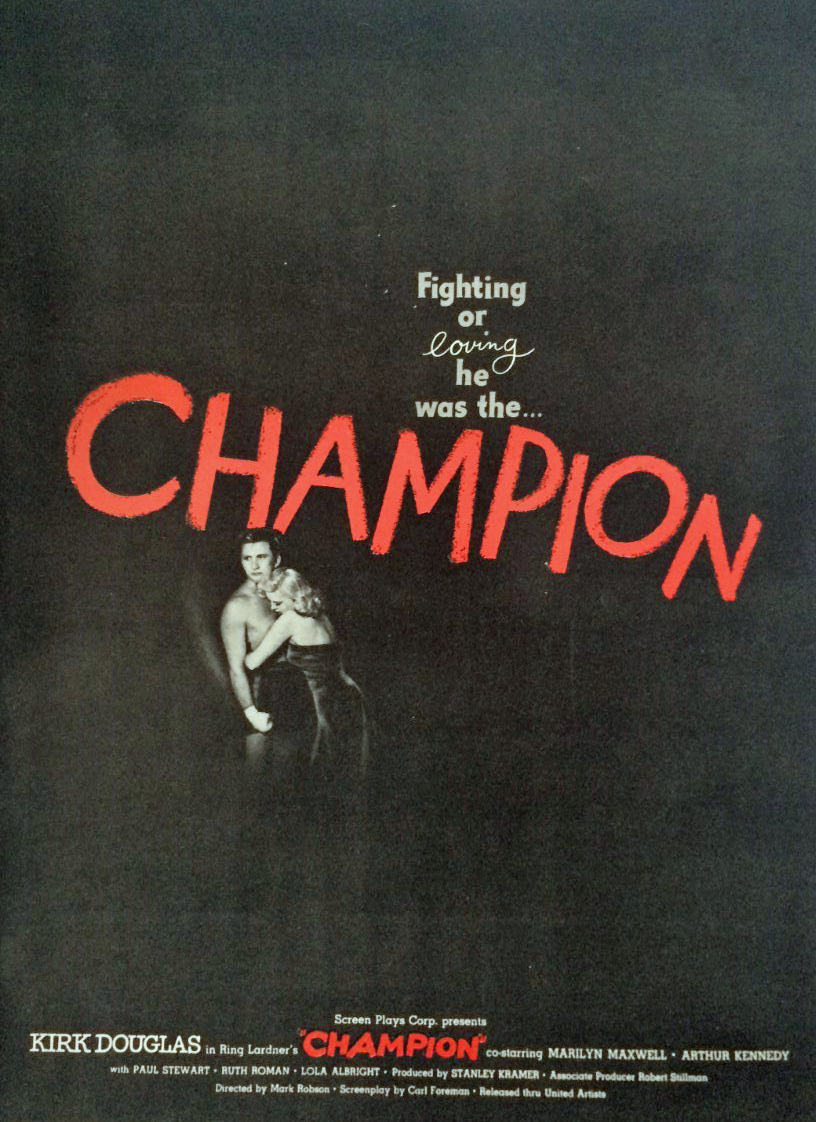
Says Bass in the Academy’s oral history, “It was a breakthrough ad generally. It was more a function of the audacity of using such a concentrated bullet in the center of the page. It really caused a tremendous stir at the time. You have to understand the abysmal state [of most other ads] … (laughs).”
Bass continues, “It’s a fairly, how shall I say, classic, emotional ‘POW!’ There’s nothing terribly — it’s not a sophisticated notion. If you took that same shot and blew it up, it would be embarrassing. It would be part of the things we joke about Hollywood, and … Hollywood advertising.”
He adds, “But what made it work is that it didn’t matter how outrageous or how corny the condition was — after all, Kirk Douglas standing there bare-chested with his hands at his side, his chest out, and his feet planted in the ground, the champion, you know, and then the lady wrapped around [him] — it’s a cliché. It’s a cliché which, however, when embedded in this new condition, transcended its clichéness.”
The same image from the ad was used as the 24-sheet to advertise the “Champion” on billboards, according to the pressbook for the movie.
After “Champion,” Bass continued doing consumer material such as ads (and sometimes posters as well) for various Kramer films, including “Cyrano De Bergerac,” “The Men” and “Death of a Salesman.”
“Death of a Salesman” came out in December 1951. In 1952 Bass left the agency world and became a freelance designer.
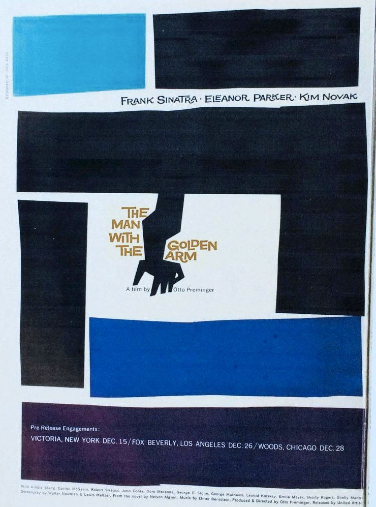
Another major breakthrough for Bass came in 1955. While working for Otto Preminger he came up with the iconic poster and ad campaign — consumer and trade — for “The Man With the Golden Arm.” Here’s one of the trade ads from that campaign that I found in an issue of Motion Picture Daily from Tuesday, Nov. 29, 1955.
As for the posters and other consumer movie material Bass worked on through the mid-1950s, work still remains to be done to get it all identified and made public. Not the least of this would be a definitive list of the movie material Bass worked on for Howard Hughes and RKO — if it’s even possible, at this late date, to ever compile such a list.
This article deals particularly with actual examples of Bass-designed movie ads and posters in 1954, 1955 and 1956 that were drawn for Bass — under his very specific instructions — by Al Kallis. They are mostly rough sketches, drawn in black and white, and a lot of them were not actually used. The value of those pieces is that they tell us what ads and posters Bass wanted to do for those films. As for the work that was used, it gives us, for the first time publicly, work that can now be definitely identified as Bass’s — since none of the material involved included his “designed by Saul Bass” signature.
I was very excited when Al Kallis recently shared with me the 66 movie-related pieces he drew for Bass, and I am equally excited that’s he’s agreed to let me share this work with you.
In a few interviews over the years — including one with Pat Kirkham, the co-author of the authoritative “Saul Bass: A Life in Film & Design” book — illustrator Al Kallis has spoken about the work he did for Bass.
By the summer of 1954 Bass had been on his own for several years. Al Kallis was also in L.A. by then, and was working as a freelance illustrator.
The first movie project they worked on together was for “Magnificent Obsession.” Interestingly, it was a Universal-International film, so Al’s Dad, Maurice, was ultimately responsible for the campaign.
In his 2015 memoir, “Living the Gift of Time,” Al Kallis writes, “My most interesting client was the gifted designer Saul Bass. Early in his career Saul was primarily involved with motion picture advertising. I made rough layout art based on his ideas and also created finished art.
“Saul was my only encounter with an art director with an original eye. He was beyond the basics of earning a living and pleasing the client. He believed the design was of equal importance to the message. I found it inspiring to work with him.”
Kallis was even more expansive in the interview he did with Pat Kirkham that appears in the Bass book she co-wrote: “No matter how small an image or job, Saul articulated exactly what he wanted. In the explanation of a job, he showed a deep understanding of the motivation of the material. He spent a lot of time on that sort of thing. It was rare to get such an intensive briefing from anyone else. Others would state briefly what they wanted. It was over in five minutes. With Saul it was different. He knew exactly what he wanted you to do!”
One can only imagine their conversations, back in 1954 — Bass the independent art director, at 34, giving the independent, freelance illustrator Al Kallis, five years his junior, explicit directions on what he wanted.
Fortunately for us, Kallis kept photographic copies of the movie work he did for Bass. Kallis kept the copies for the simple reason that he was a freelancer and needed them to show others examples of his work.
To see the work Kallis did for Bass, I’ve created a page for each film. Here they are, in order of the film’s release date. Each line below is a separate clickable link:
“Magnificent Obsession” — Universal-International — release/premiere date: Aug. 4, 1954
“A Star is Born” — Warner Bros. — Sept. 29, 1954
“Carmen Jones” — Twentieth Century Fox — Oct. 5, 1954
“The Racers” — Twentieth Century Fox — Feb. 4, 1955
“Not as a Stranger” — United Artists — June 28, 1955
“The Shrike” — Universal-International — July 7, 1955
“The Virgin Queen” — Twentieth Century Fox — July 22, 1955
“Mister Roberts” — Warner Bros. — July 30, 1955
“My Sister Eileen” — Columbia — Sept. 22, 1955
“The Rose Tattoo” — Paramount — Dec. 12, 1955
“The Conqueror” — RKO — Feb. 22, 1956
“On the Threshold of Space” — Twentieth Century Fox — March 29, 1956
[NOTE: The opening line in this essay I borrowed from the first line of Joseph Heller’s great novel “Catch-22.” One question you might have is why Pat Kirkham only included two of Kallis’ publicly unseen movie work for Saul Bass in the book she and Jennifer Bass had published in 2011, “Saul Bass: A Life in Film & Design.” Kallis said he showed her most if not all of his Bass movie work, and she indeed refers to some of it in the book. And the two pieces that are in the book give no credit to Kallis for actually drawing them. It may be that Kirkham and Jennifer Bass primarily wanted to focus on Bass’ finished products. Likewise, Jan-Christopher Horak interviewed Kallis for his 2014 book “Saul Bass: Anatomy of Film Design.” He also mentions the unseen work Kallis did for Bass, but only requested to put one of Kallis’ sketches — the one for “The Shrike” — into his book. Finally, in 2015, Al published seven of his movie posters/ads that he drew for Bass in his own memoir, “Living the Gift of Time.” Today, however, marks the first public presentation of all 66 movie-related drawings Kallis did on assignment for Bass. I want to thank Al and his wife, Trudy, for their hospitality during the several afternoons we’ve spent together, and Al’s generosity in allowing me to share all of his Bass work with you. The story Bass wrote about his mother and creativity that I cite above is included in an essay Bass wrote for the book “Creativity, An Examination of the Creative Process,” which was published by the Art Directors Club of New York in 1959.]
This article brought back so many memories. I began my career in exhibition during the 1950’s working for Paramount/ABC-Paramount Theatres. One of the things that I enjoyed was cutting and pasting newspaper ads for our current feature. In those days we used press books and ordered ad mats. As I looked at the list of ads designed by Mr. Bass, I realized that I had created newspaper ads for several of the films listed.
Thanks for the memories!
Pete Bergamo
Poughkeepsie, NY